Showing posts with label art. Show all posts

Thursday, July 4, 2013

Parable of the Banana Leaf

Charles and Ray Eames were brilliant designers. For them, design wasn't about style, it was a philosophy and a way of living and thinking. This is from a lecture by Charles Eames.

There's sort of a parable I'd like to . . . In India . . . I guess it's a parable: In India, sort of the lowest, the poorest, the, those, those without and the lowest in caste, eat very often--particularly in southern India--they eat off of a banana leaf. And those a little bit up the scale, eat off of a sort of a un . . . a low-fired ceramic dish. And a little bit higher, why, they have a glaze on--a thing they call a "tali"--they use a banana leaf and then the ceramic as a tali upon which they put all the food. And there get to be some fairly elegant glazed talis, but it graduates to--if you're up the scale a little bit more--why, a brass tali, and a bell-bronze tali is absolutely marvelous, it has a sort of a ring to it. And then things get to be a little questionable. There are things like silver-plated talis and there are solid silver talis and I suppose some nut has had a gold tali that he's eaten off of, but I've never seen one. But you can go beyond that and the guys that have not only means, but a certain amount of knowledge and understanding, go the next step and they eat off of a banana leaf. And I think that in these times when we fall back and regroup, that somehow or other, the banana leaf parable sort of got to get working there, because I'm not prepared to say that the banana leaf that one eats off of is the same as the other eats off of, but it's that process that has happened within the man that changes the banana leaf. And as we attack these problems--and I hope and I expect that the total amount of energy used in this world is going to go from high to medium to a little bit lower--the banana leaf idea might have a great part in it.

Saturday, February 5, 2011

Artist at Work

Jacques Boissinot, Artiste-peintre, Gatineau, Quebec

©2010 Darren DeRidder

Saturday, December 4, 2010

Local Artists in the Glebe

This weekend two of my favorite local artists are exhibiting in the Glebe.

Jaya Krishnan
Exhibiting a new series of paintings at Morala in the Glebe.  Visit Jaya's web site here: http://www.jkrishnanart.com/


Bhat Boy
Exhibiting at Snapdragon Gallery in the Glebe through mid-December.  Visit Bhat Boy's web site here: http://www.bhatboy.com/

Sunday, December 13, 2009

Canons of Layout

I've always been interested in the aesthetic of well balanced spaces and trying to understand why some geometries are so much more pleasing than others.  Because I get a lot of visitors who're interested in web development and testing, I thought an article on the aesthetics of layout and some general rules of thumb might be worthwhile.

With the growth of the Internet, a vast amount of content has been published online, and almost none of it adheres to any formal principles of margin and type areas, "laws of form" or page design "canons".  In medieval times when books were a rarity and publishing houses were few, considerable time and effort was put into achieving the perfect layout, with most printed works relating to the Golden Ratio.  Collectors of rare books appreciate the "truly beautiful" proportions of the pages.  It was very rare for publishers to deviate from the two or three most common "canons of page design".

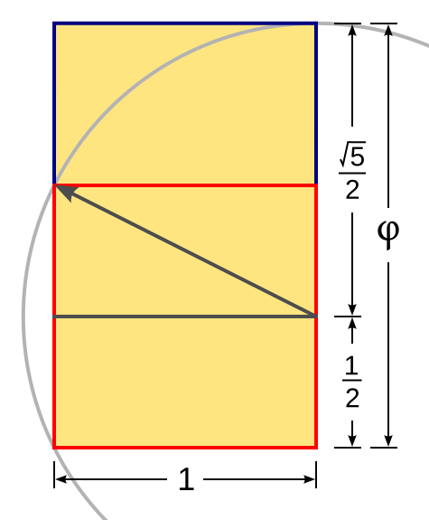
I first became aware of these canons when researching the Golden Ratio and its relevance to architecture, art and design.  The Golden Rectangle, which is based on the Golden Ratio, is considered to be the most beautiful shape in the world.  This is so for a reason.  Many forms in nature follow the Golden Ratio, from the proportions of the human face, to the branches of trees, the patterns of sunflower seeds, or the cross sections of sea shells.  The Golden Ratio is found in ancient architecture and design from the Parthenon to Zen gardens.

The Golden Ratio is expressed mathematically as (a+b)/a = a/b = φ.  This simple mathematical statement is marvelously elegant.  It simply says that the sum of parts a and b are to the larger part a, what a itself is to the smaller part b.  Now, if a and b are taken to be quadrilaterals, the presence of two dimensions produces a curious phenomenon: the proportions of the rectangle b are identical to the proportions of the rectangle (a+b).  This is known as the Golden Rectangle, and it is a Fibonacci series.  It's recursive.  Therefore b is also a Golden Rectangle, and can be divided into c and d, where (c+d)/c=c/d.  And so on and so forth, ad infinitum.  And therein we find the elegant spiral of the nautilus, the radiating pattern of the seeds of a sunflower, the rings of Saturn, a butterfly's wing, or as Leonardo Da Vinci's Vetruvian Man illustrates, the shape of the human body (some adhering a little more closely to the Golden Ratio than others, I hasten to add).

On to another canon of page design.  There was a design sometimes known as "the Secret Canon" that was used in many medieval incunabula.  It was used by Gutenburg, for example, and features margins of 1/9, 2/9 and a text area of the same proportions as the page.

There are a number of more (relatively) modern interpretations of how this ancient and beautiful layout were acheived, one of the more common being the Van de Graaf Canon, seen here.


The dark lines have been used to reconstruct the proportions of the Secret Canon.  Here is an interesting challenge:  see if you can determine in which order these diagonal lines had to be drawn in order to come up with the red text boundary.  It's a great exercise to go through; it will make you start thinking like a page designer.

Notice how the red rectangular text area is the same proportion as the page itself (only smaller).  Also notice the left and right magins, being 2/9 and 1/9 respectively for the left page, and how the left and right page together form a center margin of 1/9 + 1/9 = 2/9, equal to the outside edges.

There are a number of other canons for page design, many approximating the Golden Ratio or it's convergents.

Tschichold's Interpretation of the Golden Canon


Raul Rosarivo's Interpretation of the Golden Canon compared with Tschichold's Golden Canon.


Now, you're probably reading this on a computer screen, and computer screens are different than printed book pages, so it might seem a stretch to imply that medieval canons of design could apply to modern web page layout.  But I happen to be writing this on a screen with 1280 x 800 resolution.  And guess what 1280 by 800 is?  It's 1.6, or φ, the Golden Mean.  It seems after spending too long in the dark ages of digital incunabula, we might be on the cusp of a renaissance in digital layout.  You've probably noticed LCD monitors shifting from the squat 1.3 ratio to the elegant wide-screen models that approximate the Golden Mean.

I'm not suggesting that designers everywhere should go out and study Fibonacci numbers and medieval typography.  Rather, all of this points to (in my interpretation, at least) a more fundamental concept - that the human mind is, above all, a highly adapted pattern-recognition engine.  That human beings, and perhaps all living things, are innately attracted to order and repetition.  And perhaps this attraction to order, symmetry and repetition is a counterpart to entropy and the tendency towards chaos.  Yin and Yang.  The light and dark side of the force.  But let's leave philosophy aside and return to the topic of layout.

Dealing with web pages as a medium, layout is generally more complex than a simple one or two-column type area.  Banners, callouts, images and menus will all compete for screen real estate. But it's still possible to come up with a beautiful layout by following a few simple guidelines.  Here are a couple simple rules of thumb I use when considering a page layout.

1. Consolidate Boundaries

Look at a web page and, scanning left to right, find all the edges you possibly can.  The left-hand margin of the page.  The edge of the first letter of each line of text.  Every vertical line that forms a left or right-hand boundary for any section of the page.  Edges of margins.

Now, draw imaginary vertical lines from the top of the page to the bottom, one line for every edge that you have found.  As a general rule of thumb, the more of these vertical lines there are, the worse the design will look.  Text justification is a great tool for consolidating boundaries.  Be especially vigilant for boundaries on forms - they are often the very worst offenders.

2. Find Symmetry

Next, ask yourself if there is any symmetry in the pattern of imaginary vertical lines.  For example, is the distance between two vertical lines on one side of the page the same as the distance between two vertical lines on the right side of the page.  Scan the page from top to bottom and identify all the margins, like the space between paragraphs or the vertical margin above a banner.  Once you have identified all margins, both horizontal and vertical, ask yourself why the margin is the width it is.  If you can't find any logical reason why a margin has it's particular width, consider it a mistake.  It should be that particular width because it forms part of a repeating pattern or adheres to a discernible ratio.

3. Use Patterns

Remember the idea that the human mind is a pattern-recognition engine.  It's what makes music beautiful to us.   Remember the Golden Ratio (especially the symmetry and repetition it embodies).  It's what makes shapes, faces, and design beautiful to us.  Use symmetry and repetition to base your layout on subtle patterns that the human mind will subconsciously pick up and find innately attractive. A pattern doesn't have to be boring, a mirror image, or based on multiples of two.  Remember the number 3, once considered the divine number.  Remember ninths of the secret canon (three times three) and consider using them as a guideline for creating margins and white space.  Consider layout that reflects the symmetry of the end-user's screen itself, with horizontal and vertical margins being the same in proportion to the vertical and horizontal screen resolution of their monitor (easy to accomplish with percentages).

(Update - since originally writing this article, grid-based layouts have become increasingly popular. I recommend checking out the following resources on grid-based design.)

4. Need a shortcut? Use a Grid!

Grid-based design has evolved in response to some of these issues. Two popular examples are the 960 Grid System  and Twitter Bootstrap grid system.  For many examples of web sites designed with a grid, and interesting comments from designers about ratios, margins and the Golden Mean, check out this Smashing Magazine article.

----

Eventually somebody is going to come along and write a book on Canons of Digital Page Design.  That person is not going to be me.  So until that book comes out, I hope this article was interesting for you and will give you some ideas next time you have to shoot a photo, hang some paintings on a wall, dig a flowerbed, or design a web page.  Good luck and have fun!

Images courtesy of Wikimedia Commons

Sunday, April 13, 2008

Math Makes Music

I've written before about the intersection of art and technology. As a musician and an engineer, I'm always interested in art that is techie and tech thats artful. Last week I had the distinct pleasure of discovering a little piece of technology that I think is one of the coolest things I've ever seen in my life, ever. It's a software-based piano synthesizer that turns the whole world of digital piano technology on it's head.

Piano players can't really lug a piano around easily, so you never know when you show up at a gig what kind of instrument you'll have to play on. I've seen everything from a Bosendorfer to a beat up electronic Casio with the sustain pedal polarity wired in reverse. The notes wouldn't stop until you stepped down on the pedal, exactly the opposite of how it normally works. It was like trying to drive down the freeway backwards.

Like a lot of other pianists, I sprung for a decent digital stage piano that I can take to gigs with me. It's also good for recording, because miking a recording on an acoustic piano is hard to do properly. With digital, you can go back and fix your mistakes! For a number of reasons, a digital piano is really useful. But they have never been able to fully replicate the sound of a real acoustic grand piano.

In recent years, software based "sampled" digital pianos have gotten really good. Some take up hundreds of megabytes or gigabytes of disk space, with each note on the piano recorded at different velocities for up to 60 seconds, with and without the sustain pedal. Playing a moderately polyphonic piece of music requires a ton of memory and CPU power. If you have too many notes sustaining at once you can get clips and drop-outs. No matter how good they sound they are just not the same as playing a real piano.

Pianoteq takes a totally different approach. Rather than trying to record every nuance of an acoustic piano and replay the sound samples in software, Pianoteq builds a mathematical model of the physics of a piano. Everything from the length of the strings to the hardness of the felt hammers to the impedence of the soundboard is taken into consideration... and presented in the clean user interface so you can tweak it. You can build a10-meter long piano if you want to! As a bonus, there are no gigabytes of sampled data to download; the whole program was less than 14 megabytes! It mathematically calculates what the waveform of the sound will be, taking all the parameters into consideration, and then constructs the sound image in real-time.

At some point in their musical development, an instrumentalist comes to the realization that a truly fine instrument can actually make them play better. After you've spent years working on your chops, you sit down with a really great instrument and notice all sorts of ideas and techniques suddenly bubbling out of your creative reservoir. That's when you can really tell a great instrument from the mediocre. And you know, nothing is going to compare with a 9ft Bosendorfer, but after playing just about every model of grand piano out there, and dozens of digital pianos and software synths, I sat down with this Pianoteq software and was blown away. It made me play better. In one evening of jamming with it I came up with more ideas, changes and riffs than I have in months.

After keeping a careful eye on a dozen or so digital sampled piano packages, waiting for something truly convincing to come along, the wait is over. Pianoteq has what it takes.

Although I agree with another reviewer that some of the preset piano models sounded a little bit flat in the mid-range right out-of-the-box, I'll be quick to point out that the onboard EQ and reverb settings, not to mention the individual harmonic overtone settings, let you tweak the tone color to your heart's content. Actually, I suspect whats happening is that Pianoteq is almost too realistic, and those of us who've gotten used to the heavily-processed sampled piano sound just are not used to the natural purity of tone coming out of our headphones. And no other piano software gives you the range of configurable parameters to construct any type of piano model from a 9ft concert grand to a1980's vintage Yamaha CP80 electric stage piano.

Created by a pianist-turned-mathematician, Pianoteq is a great example of the combination of art and technology to produce something brilliant.

Monday, August 27, 2007

Les Saisons


Elizabeth Rutledge is an artist whose work I greatly admire. Her paintings are currently on display at Les Saisons in Old Chelsea, Quebec. There is very little information online about the artist, but a brief description is available at Tour Des Ateliers.

Wednesday, May 16, 2007

Gödel, Escher, Bach

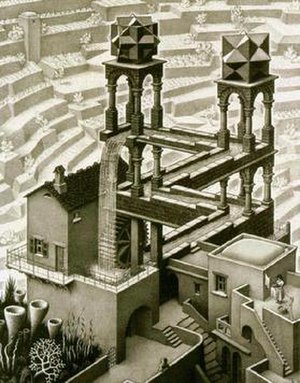
In the book Gödel, Escher, Bach: a metaphorical fugue on minds and machines in the spirit of Lewis Carrol, author Douglas Hofstadter refers to great works of logic, art and music as three aspects of a central essence, different expressions flowing from a common source.

It strikes me as interesting that lot of the great hackers are also fairly accomplished musicians, to one degree or another. Quite a few of the engineers I know and respect happen to be quite musically talented. It may not be mere coincidence, either.

Of course there are plenty of good programmers out there who never took up a musical instrument. However, I've begun to see the musician/hackers and the pure technicians differently.

The technician is the person who is fascinated with technology. They actually like complicated things, and figuring out what makes them work. They get a sense of accomplishment from having mastered a particularly difficult piece of software, much like solving a puzzle. They've probably built several computers from spare parts and are constantly upgrading their various electronic gadgets with the latest technology.

On the other hand, Musician/hackers are fascinated with creating things, and see technology as a way to express themselves. They're less likely to be captivated by the latest high-performance video card or Java SDK. Whatever allows them to get to work immediately creating things, and gives them the greatest range of artistic license, is what they like. They don't want to make things that are complex, they want to make things that are elegant.

Technology irks me most of the time, because it tends to be artless. A collection of functionality that is no greater than the sum of its parts. Musician / hackers don't just want to build programs that do things, they want to build programs that do things beautifully. I realized this when I began to notice the similarities between composing music and writing computer programs.

There are cases when the artist is needed. Chances are, the undergrad who just created the latest most-popular web application software is one of these. Unfortunately, there is a downside. Artists, particularly musicians, are hard to get along with. They especially don't get along well with other musicians. This is because they want control over what they see as the creative process. Suppose someone had gone up to Leonardo da Vinci when he was painting the Mona Lisa, and said, "You got the smile crooked!" Or if someone had insisted Bach write his Brandenburg concertos featuring the bagpipes. Can you imagine? Such is the indignation of the musician / hacker when told he must conform to such-and-such a dictum.

Artists work best when there aren't so many people telling them how to create their artwork. As a result, they're more likely to enjoy working alone or in a small group, but they might also be more likely to create something elegant.

Productivity and Note-taking

I told a friend of mine that I wasn't really happy with the amount of time that gets taken up by Slack and "communication and sched...