Monday, December 28, 2009

Head-Smashed-In Buffalo Jump

UNESCO World Heritage Site, Head-Smashed-In Buffalo Jump, Alberta, Canada


© 2009 Darren DeRidder

Sunday, December 13, 2009

Canons of Layout

I've always been interested in the aesthetic of well balanced spaces and trying to understand why some geometries are so much more pleasing than others.  Because I get a lot of visitors who're interested in web development and testing, I thought an article on the aesthetics of layout and some general rules of thumb might be worthwhile.

With the growth of the Internet, a vast amount of content has been published online, and almost none of it adheres to any formal principles of margin and type areas, "laws of form" or page design "canons".  In medieval times when books were a rarity and publishing houses were few, considerable time and effort was put into achieving the perfect layout, with most printed works relating to the Golden Ratio.  Collectors of rare books appreciate the "truly beautiful" proportions of the pages.  It was very rare for publishers to deviate from the two or three most common "canons of page design".

I first became aware of these canons when researching the Golden Ratio and its relevance to architecture, art and design.  The Golden Rectangle, which is based on the Golden Ratio, is considered to be the most beautiful shape in the world.  This is so for a reason.  Many forms in nature follow the Golden Ratio, from the proportions of the human face, to the branches of trees, the patterns of sunflower seeds, or the cross sections of sea shells.  The Golden Ratio is found in ancient architecture and design from the Parthenon to Zen gardens.

The Golden Ratio is expressed mathematically as (a+b)/a = a/b = φ.  This simple mathematical statement is marvelously elegant.  It simply says that the sum of parts a and b are to the larger part a, what a itself is to the smaller part b.  Now, if a and b are taken to be quadrilaterals, the presence of two dimensions produces a curious phenomenon: the proportions of the rectangle b are identical to the proportions of the rectangle (a+b).  This is known as the Golden Rectangle, and it is a Fibonacci series.  It's recursive.  Therefore b is also a Golden Rectangle, and can be divided into c and d, where (c+d)/c=c/d.  And so on and so forth, ad infinitum.  And therein we find the elegant spiral of the nautilus, the radiating pattern of the seeds of a sunflower, the rings of Saturn, a butterfly's wing, or as Leonardo Da Vinci's Vetruvian Man illustrates, the shape of the human body (some adhering a little more closely to the Golden Ratio than others, I hasten to add).

On to another canon of page design.  There was a design sometimes known as "the Secret Canon" that was used in many medieval incunabula.  It was used by Gutenburg, for example, and features margins of 1/9, 2/9 and a text area of the same proportions as the page.

There are a number of more (relatively) modern interpretations of how this ancient and beautiful layout were acheived, one of the more common being the Van de Graaf Canon, seen here.


The dark lines have been used to reconstruct the proportions of the Secret Canon.  Here is an interesting challenge:  see if you can determine in which order these diagonal lines had to be drawn in order to come up with the red text boundary.  It's a great exercise to go through; it will make you start thinking like a page designer.

Notice how the red rectangular text area is the same proportion as the page itself (only smaller).  Also notice the left and right magins, being 2/9 and 1/9 respectively for the left page, and how the left and right page together form a center margin of 1/9 + 1/9 = 2/9, equal to the outside edges.

There are a number of other canons for page design, many approximating the Golden Ratio or it's convergents.

Tschichold's Interpretation of the Golden Canon


Raul Rosarivo's Interpretation of the Golden Canon compared with Tschichold's Golden Canon.


Now, you're probably reading this on a computer screen, and computer screens are different than printed book pages, so it might seem a stretch to imply that medieval canons of design could apply to modern web page layout.  But I happen to be writing this on a screen with 1280 x 800 resolution.  And guess what 1280 by 800 is?  It's 1.6, or φ, the Golden Mean.  It seems after spending too long in the dark ages of digital incunabula, we might be on the cusp of a renaissance in digital layout.  You've probably noticed LCD monitors shifting from the squat 1.3 ratio to the elegant wide-screen models that approximate the Golden Mean.

I'm not suggesting that designers everywhere should go out and study Fibonacci numbers and medieval typography.  Rather, all of this points to (in my interpretation, at least) a more fundamental concept - that the human mind is, above all, a highly adapted pattern-recognition engine.  That human beings, and perhaps all living things, are innately attracted to order and repetition.  And perhaps this attraction to order, symmetry and repetition is a counterpart to entropy and the tendency towards chaos.  Yin and Yang.  The light and dark side of the force.  But let's leave philosophy aside and return to the topic of layout.

Dealing with web pages as a medium, layout is generally more complex than a simple one or two-column type area.  Banners, callouts, images and menus will all compete for screen real estate. But it's still possible to come up with a beautiful layout by following a few simple guidelines.  Here are a couple simple rules of thumb I use when considering a page layout.

1. Consolidate Boundaries

Look at a web page and, scanning left to right, find all the edges you possibly can.  The left-hand margin of the page.  The edge of the first letter of each line of text.  Every vertical line that forms a left or right-hand boundary for any section of the page.  Edges of margins.

Now, draw imaginary vertical lines from the top of the page to the bottom, one line for every edge that you have found.  As a general rule of thumb, the more of these vertical lines there are, the worse the design will look.  Text justification is a great tool for consolidating boundaries.  Be especially vigilant for boundaries on forms - they are often the very worst offenders.

2. Find Symmetry

Next, ask yourself if there is any symmetry in the pattern of imaginary vertical lines.  For example, is the distance between two vertical lines on one side of the page the same as the distance between two vertical lines on the right side of the page.  Scan the page from top to bottom and identify all the margins, like the space between paragraphs or the vertical margin above a banner.  Once you have identified all margins, both horizontal and vertical, ask yourself why the margin is the width it is.  If you can't find any logical reason why a margin has it's particular width, consider it a mistake.  It should be that particular width because it forms part of a repeating pattern or adheres to a discernible ratio.

3. Use Patterns

Remember the idea that the human mind is a pattern-recognition engine.  It's what makes music beautiful to us.   Remember the Golden Ratio (especially the symmetry and repetition it embodies).  It's what makes shapes, faces, and design beautiful to us.  Use symmetry and repetition to base your layout on subtle patterns that the human mind will subconsciously pick up and find innately attractive. A pattern doesn't have to be boring, a mirror image, or based on multiples of two.  Remember the number 3, once considered the divine number.  Remember ninths of the secret canon (three times three) and consider using them as a guideline for creating margins and white space.  Consider layout that reflects the symmetry of the end-user's screen itself, with horizontal and vertical margins being the same in proportion to the vertical and horizontal screen resolution of their monitor (easy to accomplish with percentages).

(Update - since originally writing this article, grid-based layouts have become increasingly popular. I recommend checking out the following resources on grid-based design.)

4. Need a shortcut? Use a Grid!

Grid-based design has evolved in response to some of these issues. Two popular examples are the 960 Grid System  and Twitter Bootstrap grid system.  For many examples of web sites designed with a grid, and interesting comments from designers about ratios, margins and the Golden Mean, check out this Smashing Magazine article.

----

Eventually somebody is going to come along and write a book on Canons of Digital Page Design.  That person is not going to be me.  So until that book comes out, I hope this article was interesting for you and will give you some ideas next time you have to shoot a photo, hang some paintings on a wall, dig a flowerbed, or design a web page.  Good luck and have fun!

Images courtesy of Wikimedia Commons

Saturday, December 12, 2009

Classic Modern

The Confederation Building reflected in the Bank of Canada Building.


 ©2009 Darren DeRidder

Thursday, December 10, 2009

The Mountaineering Journals

I've begun moving some of my old mountaineering reports to a new blog.  I like the blog format and this should make it easier to add new reports if and when I do more mountaineering.  My collection of old climbing write-ups on the original Mountaineering Journals web site is pretty big, and warrants a dedicated site, I think.

The Mountaineering Journals began as a creased collection of photo-copied trip reports that I and a few friends circulated amongst ourselves while living in Japan.  There were three main contributors, all decent writers, and some of the reports were very entertaining, especially for anyone familiar with life as a foreigner in Japan.

http://mountaineeringjournals.blogspot.com

Sunday, November 29, 2009

Building Really Elegant Web Portals, Part 2

The first part of this article talked about some principles for building really elegant web portals.  It proposes using a design pattern rather than a one-size fits all framework.  It requires no specialized software and once implemented, can be rebranded, reorganized, and re-featurized by anyone with basic HTML design skills.  Part 2 looks at more technical details of this design approach. 

An Example

The following example shows a simple contacts list with email addresses.  The layout of the page is already set up, so we just insert a simple tag, <?Widgets::membershipList?>, to create the list.  It looks like an HTML tag, but it automatically expands into the full contacts list.


Obviously this is a simple example, but you can see how easy it would be to move this widget around, change the CSS styling, relocate to another page or change the entire look and feel of the site around it.  Even if the whole layout of the portal changes, this widget will still provide the same functionality.

Some readers will point out that there have been a number of implementations of this approach, and they’re absolutely right.  This technique has roots going all the way back to Server-Side Includes, or “SSI”.

SSI and CGI Paradigms

Traditionally there have been two approaches to building dynamic web applications: the CGI approach and the SSI approach.  The difference between these two approaches has major implications for a web application so it’s good to know which approach you’re going to take and why.

In the CGI approach, a server-side script often generates an entire web page from top to bottom, including the HTTP headers, although in some cases the script performs an action on the server and then redirects to a landing page.  The CGI technique works really well for creating an API for handling actions, and it can work well for a large web sites with lots of pages using the same layout.

In the SSI approach, the document being requested contains snippets of code that get converted to HTML before it is sent to the browser.  SSI excels when it comes to presentation, allowing everything but the dynamic content to be written in plain old HTML.  The SSI approach can be very useful for separating out the functional parts of a portal from the layout and presentation.

The Widgets Pattern uses both CGI and SSI paradigms.  Understanding the difference between SSI and CGI Paradigms is an important part of the approach.

N-Tier Architectures and the MVC Pattern

The well-known MVC pattern and “N-Tier architectures”, are good design practices that separate the data, presentation, and application logic.  One principle from MVC that works well regardless of the scale of the project is to create a clean break between the data store and the rest of the application.  A great way to do this is to wrap the database in a web service of it’s own, a la Service-Oriented Architecture.  In a LAMP situation I would recommend using JSON or XML-RPC, never SOAP.  The reasons for this would require another article, so let’s just move on...

Assuming that our database is nicely encapsulated in an XML-over-HTTP interface with the requisite create-read-update-delete methods, lets see how the rest of the Widget Pattern works.


The Principle of Linear Includes

The diagram above is the core of the Widgets Pattern.   One of the key features of this design is the principle of linear includes.  Each file contains a class, and includes only one other file at most.  This is different from a lot of code bases where each class file contains a long list of includes.  It might seem like this would make code organization difficult, but I found that it forced me to organize the code very efficiently, to encapsulate responsibilities carefully, and to build clean, intuitive interactions between the layers.  It might also seem like the files would get really huge, but I found that with the responsibilities cleanly divided like this, the methods within each class were very concise - often just a few lines.

The Widgets Layer

The pattern uses classes not for object instantiation, but purely for namespaces.  So the membershipList widget in the example above was written as widgets::membershipList.  The Widget Layer does one thing and one thing only!  It takes the data structures passed up from the Utilities Layer and wraps them up in HTML.  That’s it, nothing more.

The Utilities Layer

The Utilities Layer is where application logic resides.  The Utilities Layer does one thing, and one thing only!  It issues messages and correlates responses.  This could mean for example that it sends a message to read a user’s account information, another message to read subscription details, and combines the two responses into one array of data to return.

The Messages Layer

The Messages Layer does one thing, and one thing only!  It knows the syntax of the messages to issue for each of the CRUD operations supported by our data store.  If the database is behind an XML-RPC interface, this means that the Messages Layer has a bunch of methods that contain the correct XML syntax for each of the operations supported by that interface.  When one of these messages is invoked, the variable parameters of the message are filled in, the message is fired off and the response is returned. Again, a very simple and limited scope of responsibility.

The Connection Layer

The Connection Layer does (you guessed it) one thing, and one thing only!  It manages the connection to the database server.  Utilities that require multiple messages reuse the same connection.

The Configuration Layer

Throughout the code there will be, of course, parameters that should be configurable, whether it be an IP address, the action to perform on submit of a form, or the landing page to redirect to after an action.  So the Configuration Layer is the lowest layer in the stack, meaning all the other layers can make us of it.  The Configuration Layer does one thing only! It provides getter methods for a list of parameters that are defined in a config file.  In the LAMP stack, the config file is just a “.inc” file with a list of variable declarations in name=value syntax.  Couldn’t be simpler.

Note that, if your server is configured properly, ".inc" files are parsed as php files, never sent as text. The extension you use is largely a matter of preference.

The Action Handling Layer

Borrowing a page from CGI, the last component, sitting a bit off to the side, is the Handler. This is the component that handles actions from the user interface, particularly submitting information for updating the data store.  This component again does just one thing.  It receives requests, typically POST requests, extracts the variables from the request, including the action being requested, invokes the appropriate utility methods, and redirects to a (configurable) landing page which may or may not be the same as the page that issues the request.  It includes the Utilities layer so it has access to all the Utility methods.  In practice there will be some utility methods used by Widgets, some used by the Handler, and some used by both.  But the handler doesn’t need to provide any output to the browser other than a header that redirects it to the correct landing page, in the case of success, or an error page, in the case of failure.

Performance

The question of performance often comes up.  Please refer to my article “A Policy of Simplicity” which talks about getting exceptional performance from LAMP-based applications.  The venerable APC cache will be of interest in this regard, although other byte-code caching and code optimization tools are available.  APC is among the best options and performs extremely well. In fact, I have yet to come across a platform that can perform better.

On the way to really elegant web portals


This article is really nothing more than the application of some good design principles in a popular medium, and I hope it helps some designers who might be thinking through different approaches and leads to some really elegant web portals! 

This approach has been used for portals in a number of 1st-tier telecommunications companies.  It has enabled rebranding and feature requests to be implemented with unprecedented rapidity, and enabled clients to implement their own functionality with very little assistance, very quickly.  Having seen the success of this approach in the field, I wouldn’t go back to using a cumbersome application framework unless there was clearly a performance benefit to be had.  One possibility would be the LYME stack, and I’d like to spend some time with it. I expect that the Widgets Pattern would also work very well with it.

In the next couple of weeks I’ll try to post some code examples that demonstrate the Widgets Pattern in action.  Till then, take care and have fun!

Saturday, November 28, 2009

Piz Balzet

Yours truly leading pitch one of the Piz Balzet, Albigna, Switzerland.


Photo ©2008 by Iain Williams

Monday, November 23, 2009

New Belcanto

Mike del Ferro, "New Belcanto - Opera Meets Jazz"

Great discoveries should be shared.   I came across Mike del Ferro's rendition of Nessun Dorma on Imeem.com more than a year ago.  Several months ago I went back and found that it was gone.   I finally tracked down the album.  It's available on iTunes.   Spoiler: this album will be on my Top 5 Albums of 2009.


I've also been enjoying the new CD/DVD from my own piano teacher Brian Browne, entitled "Brian Browne Trio at the NAC".  A protege of Oscar Peterson, Brian is one of the greatest jazz pianists that Canada has ever produced.  The album is available at brianbrowne.com.


Sunday, November 8, 2009

Saturday, November 7, 2009

Saturday, October 17, 2009

Thursday, October 8, 2009

Kingston

City Hall, Kingston, Ontario, Canada


©2009 Darren DeRidder

I posted this image a while ago, but had to remove it after the comment section fell victim to a spam message.  The only way to remove the spam was delete the post.  Hopefully this has been fixed by now.

Remembering E.S.T.


http://www.youtube.com/watch?v=5mr9Ahdvpbo

Just over a year since the jazz world lost Esbjorn Svensson.  E.S.T. defined a whole new trajectory in jazz. "It's not what jazz is, but it's what jazz could be".

Tuesday, October 6, 2009

Monday, October 5, 2009

The End of a Season

The South Stands, Lansdowne Park, Ottawa


©2009 Darren DeRidder

The unused South Stands will be demolished as Lansdowne Park is slated for major redevelopment.  City officials are debating a controversial plan put forward by developers to create a massive retail and housing complex on the historic site.

Sunday, October 4, 2009

Tuesday, September 29, 2009

Building Really Elegant Web Portals, Part 1

This is part one of a two-part article.  Part two is here.


This article discusses principles for building really elegant web portals. More precisely, it’s about how to build portals in a really elegant way. Even though I use a particular development stack for the example implementation, the principles can apply generally to other platforms as well.

Web-based applications and interfaces have become very popular.  Even certain kinds of equipment, like routers, generally implement a web-based GUI.  In the telecom community, sites that allow subscribers to access and manage their services are often referred to as "portals".  There are a lot of approaches to designing a portal site, and a lot of potential pitfalls that could be avoided with the right approach.

A Design Pattern for Portals

Usually, when a portal has to be built, people go looking around for a framework to use, or they use the one they already know.  There are some pretty good frameworks out there, but in my experience I've found most of them to be too unwieldy, bloated, complicated, slow and error-prone for my taste.  They seem to get in the way more than helping.

Instead of a framework, what I propose is a design pattern.  For lack of a better phrase I call it the Widget Pattern.  There's already a lot of information about design patterns, when to use them, and the pros and cons of custom development versus one-size-fits-all frameworks, so I won't get into that.  The Widget Pattern is really simple, and it's been used with great success in lots of other areas besides portal design using other names  -- its just not seen quite so often in web applications.

The core of the idea is to provide a collection of widgets that a relatively non-technical person can utilize to customize or build a portal using just basic HTML and CSS skills.  It also attempts to separate functionality from content and presentation, putting them into separate areas so individuals with different roles can take responsibility for their area of expertise.  In this part, we'll look at those roles and responsibilities and the problems that the Widget Pattern is trying to solve.

It's really important to recognize the different roles people play when it comes to portal development, and to let them all do their role without stepping on each others toes.  The developers should really focus on functionality.  Then the marketing folks can really focus on the layout, messaging and workflow.  The graphic designer can really focus on getting the visuals right.  But a lot of frameworks sort of lump everything together, forcing you to go through a big learning curve before you can make even small changes to the site.

Everyone's a Designer

Web sites are a lot like wardrobes. Whoever assumes responsibility for a web site immediately wants dress it up differently.  Our taste in fashion is as unique and individual as the way we look, and can be a form of self expression.  In a similar way, the urge to reconstruct the visual components of a website appeals to our individual aesthetic sense, and promises to be noticed!

Interfaces are highly visual, so they’re really easy to latch onto, put on powerpoint slides and debate.  Since everyone has a different idea of what looks good, it makes a never-ending source of meeting-fodder.  Interface planning can become a magnet for interminable design-by-committee projects - often with bad results.

Portal design tends to generate intense pride of ownership. Everyone attaches self-worth to their own creative endeavors, from their fashion choices to their work deliverables.  Whenever I have to design a portal or web application, I feel a pleasant rush of creative responsibility.  After all, we know that artists are not supposed to be questioned on their creative work, but given uninhibited artistic license! This sense of freedom and responsibility can be very appealing, and nobody is really immune from it.  This is the “Everyone’s a Designer” syndrome.

Unfortunately the “Everyone's a Designer” syndrome leads to a lot of bad user interfaces. Web technologies make it easy for people to unleash their inner artist, but just because you can doesn’t mean you should. I call this the “Not Everyone Should Be Allowed to Wear Spandex” principle.

The Immediacy of Interfaces

User interfaces get an immediate reaction because they're the first thing you see about a system - the point of entry.  The importance of first impressions means a lot of thought and effort to go into the presentation.  This is typically the domain of marketing specialists and graphic designers, but developers are the ones who have to implement the functionality. This can lead to difficulties, since marketing folks generally don’t understand the constraints of web development platforms, and developers generally don’t understand the difference between mauve and chartreuse, or comprehend how anyone could obsess for two weeks over the precise wording of a single paragraph. The situation can get bad if the developer has to repeatedly re-implement the fickle, frivolous whims of a marketing team that can’t make up their minds and has no appreciation for the amount of work their “minor changes” require.  Or if the marketing person keeps getting road-blocks thrown up by a developer who claims "you can't do that" for "technical reasons" that "you wouldn't understand".

Avoiding Entanglements

Design review meetings can quickly degenerate into debates on aesthetics and battles of opinion. Programming skills are not particularly well-suited to this environment, and the developer caught in the middle has a hard job ahead. This brings us to the next principle: Avoiding Entanglements.

At all costs, developers should avoid getting embroiled in debates about aesthetics, text content, layout and any other aspect that are likely to be scrutinized by marketing, branding and product level management types. For developers these things can be a phenomenal time-waster. Instead, developers should try to adopt a framework that puts power into the hands of branding / marketing folks to take ownership of as much of the presentation as possible, or at the very least make it extremely trivial to make ongoing changes to the static design.

A really elegant framework will turn a rebranding exercise into hours - instead of weeks - of effort, and from a job requiring major programming skills into one requiring only a modest familiarity with web design. This way, developers can extricate themselves from the entanglements of aesthetic debates and focus instead on functionality, while marketing and branding specialists can have a great deal of flexibility in the design and presentation of material.

Content vs. Functionality

An oft-quoted maxim of web development is “content vs. presentation”, harking back to the days when stylistic details like fonts and colors were embedded into the markup tags of text on web pages. Designers were admonished to separate content from presentation by using cascading style sheets to supply the stylistic details in a way that could be more easily swapped for alternate styles.

But the notion of separating content from presentation can be carried further. Although “presentation” typically means things like fonts, colors, layout and background images, and “content” typically means text, whenever a marketing team is hammering out the wording of a particular paragraph, the phrase in question can begin to seem a lot like a matter of presentation. Or when they're coming up with different scenarios about what should appear on the screen after clicking the “submit” button, even the workflow can be seen as a presentation concern.  Again, a really elegant portal framework will enable such decisions to be implemented and modified by the non-technical folks themselves... perhaps with a little hand-holding, but without requiring any real custom programming effort.

To enable such a level of flexibility requires more than a separation of content and presentation, it requires separation of content and functionality. This is the next principle, the Principle of Content versus Functionality.  It allows the developer to focus on what the portal should do, while the branding experts focus on what it should say and how it should look.

Offload Everything

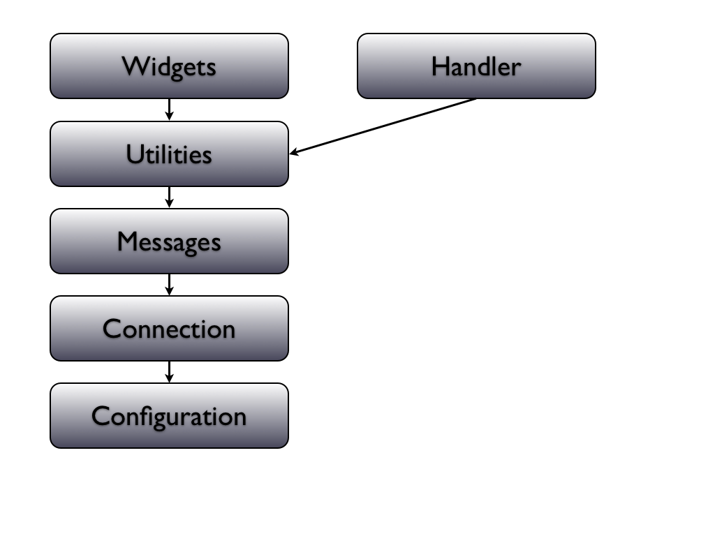
For the developer, an elegant approach to designing a portal offloads as much of the responsibility for visual and interactive decisions to other people as possible. It's the Offload Everything Principle.  That includes not only the things typically found in a stylesheet, but as much of the static content and layout as possible, too. A really elegant design should even permit changes to the “workflow” (the series of pages a user must navigate while completing a particular task) without sacrificing simplicity and a small footprint. The dynamic parts of the interface that require programming knowledge to implement should be so well encapsulated that they can be reorganized to fit the client’s unique requirements, like a collection of “widgets” that supply bits of dynamic content and functionality, and can be relocated, re-skinned and reconfigured without any special programming expertise.

Next in Part 2
As a developer, I always like to get the technical details first, and read about the justification for the design later, so I've approached this backwards by offering lots of context first.  However in the next part we'll get into the technical details of the design pattern itself.  Here is part 2.

Saturday, August 29, 2009

Strong vs Weak Typing

Apple says it best:

"If you are used to using strongly typed languages, you might think that the use of weakly typed variables would cause problems, but they actually provide tremendous flexibility and allow for much greater dynamism..."

I've always felt the same way. Its a different mindset but I wish it was more prevalent.

Thursday, July 23, 2009

Shoes and the US Health Care System

If you live in the US, and have been hearing rumblings about single-payer health care, "socialized" health care, or how terrible it would be to have a Canadian-style health care system:

don't believe a word of it.

I've lived in a few countries, including the US and Canada. Whatever you hear, Canada is a great country to live in. And one of the greatest things about Canada is universal, socialized health care.

I know there are stories of long wait times, and there's a grain of truth to some of those. But in my experience I have never had to wait very long to see a doctor. I had a broken finger fixed in an hour. I got surgery to fix a hernia in about a week and a half. I know that for certain other things, people may wait longer. But I don't know anyone who hasn't gotten the care and treatment they needed. For free.

Furthermore, work is being done in Canada to reduce wait times in areas where they may be longer, using innovative research in queuing theory and techniques learned from countries around the world, with positive results.

Now I hope you'll all listen up: Even if you added up all the waiting lists here, it still would not come remotely close to 25 million Americans who are under insured and can't get treatment at all.

The US is one of the only developed countries without universal, socialized health care. A lot of people who live and travel in other countries think the US is way behind the rest of the modern world in this regard, and they look down on Americans because of it. People need to get out from under the BS that the corporate health care and insurance companies are shoveling out, realize that corporatism is the problem - not the solution - and get on with building a system that works for everybody. Not just for people who have financial means or a good benefits package.
"Another name for a 'single-payer system' would be: healthcare as a human right, not a commodity to be purchased. Many humans have this right. They just aren't Americans." - David Swanson
I learned a while back that you can tell a lot about a man by looking at his shoes. It may not be the most obvious place to look, but a man's shoes can reveal a lot about his character. And although it may not be the most obvious place to look, you can also tell a lot about a society by the way they treat their ailing poor.

The US has a long way to go in the shoe department.

Call the following six members of Congress and ask them to vote yes for single-payer health care (H.R. 676).

Lean YesDiana DeGette CO01 202-225-4431
Jane Harman CA36 202-225-8220
Christopher Murphy CT05 202-225-4476
Frank Pallone NJ06 202-225-4671 @FrankPallone
Bobby Rush IL01 202-225-4372
Peter Welch VT00 202-225-4115

Won't Say / "Not Enought Votes"
Rick Boucher VA09 202-225-3861
Bruce Braley IA01 202-225-2911
G.K. Butterfield NC01 202-225-3101
Lois Capps CA23 202-225-3601
Kathy Castor FL11 202-225-3376
John Dingell MI15 202-225-4071
Charles Gonzalez TX20 202-225-3236
Gene Green TX29 202-225-1688
Jay Inslee WA01 202-225-6311
@RepInsleeNews
Doris Matsui CA05 202-225-7163
Jerry McNerney CA11 202-225-1947
John Sarbanes MD03 202-225-4016
Bart Stupak MI01 202-225-4735
Betty Sutton OH13 202-225-3401
Henry Waxman (Chair) CA30 202-225-3976

Friday, July 17, 2009

Banana Leaf

Excerpt from Norton Lecture #1 by Charles Eames

There's sort of a parable I'd like to . . . In India . . . I guess it's a parable: In India, sort of the lowest, the poorest, the, those, those without and the lowest in caste, eat very often--particularly in southern India--they eat off of a banana leaf. And those a little bit up the scale, eat off of a sort of a un . . . a low-fired ceramic dish. And a little bit higher, why, they have a glaze on--a thing they call a "tali"--they use a banana leaf and then the ceramic as a tali upon which they put all the food. And there get to be some fairly elegant glazed talis, but it graduates to--if you're up the scale a little bit more--why, a brass tali, and a bell-bronze tali is absolutely marvelous, it has a sort of a ring to it. And then things get to be a little questionable. There are things like silver-plated talis and there are solid silver talis and I suppose some nut has had a gold tali that he's eaten off of, but I've never seen one. But you can go beyond that and the guys that have not only means, but a certain amount of knowledge and understanding, go the next step and they eat off of a banana leaf. And I think that in these times when we fall back and regroup, that somehow or other, the banana leaf parable sort of got to get working there, because I'm not prepared to say that the banana leaf that one eats off of is the same as the other eats off of, but it's that process that has happened within the man that changes the banana leaf.

And as we attack these problems--and I hope and I expect that the total amount of energy used in this world is going to go from high to medium to a little bit lower--the banana leaf idea might have a great part in it.

-- Charles Eames

Monday, July 13, 2009

Sailing to Baskins Beach

The plan for the weekend was to set sail on Saturday after lunch and try to make it all the way to Baskin's Beach. Thunderstorms conspired to force a change of plans, but by 5:30 in the evening the skies cleared and the trip was on again. Rushing home I grabbed an extra shirt and some rain gear, ran through the grocery store grabbing pre-packaged food and snacks in a more-or-less random fashion, and zipped back to the marina where my friends Liam and Kate were already loading their Aloha 28. Basil the Dog was as excited as ever at the arrival of another crew member, especially one that he knows will slip him small pieces of cheese and bread under the table.

A pizza had been ordered and arrived just as a passing raincloud unleashed a torrential downpour on the marina. I ran back to the boat with the box in hand, and opened it up to find our "Veggie Lovers" pizza was actually a "Meat Lovers" pizza. When I called back Pizza-Pizza they refused to give a full refund. We couldn't wait for a replacement since we were about to cast off.

A mild sou'wester carried us close-hauled all the way to Aylmer Island, and as the sun went down we decided to put in at the YMCA campground on the southern shore. Here the water runs deep close to the Ontario border, unlike the shallows that lurk below the expansive waters on the Quebec side. We did only three tacks to our anchorage, one being in the narrows between Alymer Island and the Quebec shore, and hence quite a short starboard tack.

The trees were all a black silhouette against the darkening sky by the time we had the anchor set, so it was hard to tell just how close we were to shore, but the depth sounder read 14 feet. Liam rowed ashore with Basil the Dog in the tender, affectionately named "Mr. Tippy". He was aided by a rechargeable 1000 watt handheld floodlight, quite possibly the brightest flashlight in the known universe. I'm fairly certain this light would be visible from the moon. More than adequate for taking your dog for a walk.

The morning was clear and sunny and after another trip ashore with Basil in Mr. Tippy, we had pancakes. This is also when I discovered that I had soaked my contacts overnight in a glass of vinegar instead of distilled water. I barely started to put in one of the lenses and immediately knew something was wrong and pulled it out. The resulting condition was pickle-eye, and I had to throw the lenses overboard. I spent the rest of the trip looking at everything through a large pair of binoculars that had a wide focal adjustment between the two sides.

We decided to sail on to Baskins. Again, a good sou'wester carried us upriver easily, though we kept getting headed by wind shifts further from shore and had to throw in a couple of tacks. Along the way we passed Pinhey Point, site of my last overnighter, and the Port of Call Marina. A lot of beautiful houses and some large mansions line the Ontario shoreline. We wondered who these people are. I don't think they are computer programmers. Then again... they might have started out as computer programmers, you never know!

Anchoring at Baskins was a bit tricky since the water was a bit shallower than anticipated. After two or three attempts we managed to set the anchor with about 8 feet of water below. The wind had picked up quite a bit and it was cool enough for a jacket by this point, so I decided to go ashore and tour the BYC camping grounds instead of swimming. After lunch on board we motored off and set sail for a long downwind run.

We stayed on a reach most of the way to keep the genoa full. Only once we tried to go wing on wing, but the winds had continued to increase, and a few rollers were coming in from the northwest, causing us to roll. It doesn't usually happen when you're flying a genoa wing-on-wing, and is more likely to happen when reaching under a spinnaker, but an effect that is dreaded by sailors called the death roll was on my mind as the waves caused us to roll leeward to windward. The big genny on the starboard side would fill powerfully as we rolled towards it, amplifying the heeling tendency. On the third roll I eased the sheet to depower the genny, which prevented the oscillation from getting any worse. But these things are hard to control. Sometime the reactions of the crew and helmsman trying to control the boat can actually increase the oscillations and lead to an accidental gybe. I've not done an accidental gybe that I can remember. Most likely I've just been lucky so far. I have been aboard during a couple of accidental gybes, both on my own boat and others, however. We also broached under spinnaker once on my boat. Quite a scary experience; but thankfully the Tanzer is a tough and forgiving boat, and she handled it well. We crew were a little worse for wear.

With this in mind I agreed heartily as Laim called to gybe the genny. For the remainder of the sail downwind we fought gusting winds that grew so strong abeam at one point that we feared a knockdown and furled the foresail. Under big pressure, we fought to bring it in, loosed the sheets, and "ragged" the sail. It flogged crazily and shredded part of the leach. Under main only we carried on a beam reach towards harbour. We passed other boats taking shelter in the lee of Aylmer Island, and a few limping back under mainsail towards Nepean. Ahead the skies were black with clouds and rain, but approaching from behind were clear skies, promising the worst was over. Entering the harbour, the calm water and quiet air was a relief. We met a couple of boats heading out for an evening sail, but we were quite happy to be back at the mooring. Half blind, but safe and sound.

Tuesday, May 26, 2009

Port Lights

The other big project I undertook this spring was to refurbish and reseal the portlights. This turned out to be a really big job. Had I known what a big job it would be I'd have tried to get it done over the winter instead of waiting till two weeks before launch.

Initially I wanted to remove all the aluminum frames, clean them, replace the plexiglass, and reseat them with new sealant. The first frame proved incredibly hard to remove. Even using a putty knife and hammer to cut around the flange, it didn't want to come out, so I gave up on that idea and just removed the plexiglass.

When the boat came out for knotmeter replacement, I found that four of the frames were installed with white butyl and came out very easily. Of course, they'd been leaking like crazy; white butyl isn't a good solution for portlights. They were also extremely gunked up. Two of the frames were very hard to remove and I ended up resorting to brute force with a putty knife and hammer to cut through the caulking under the edge of the frame. Finally they came out, no damage to the frames thankfully but the fibreglass was a bit worse for wear. I epoxied the small gouges I'd created; they're hidden by the frames when the portlights are installed anyway.


Cleaning up the frames took a couple of days. The white butyl cleaned off easily with Varsol, but the silicon / polyurethane caulking took hours of scrubbing. I used Marine Debonder and GooGone with a scrubbing pad and a razor blade. The thing that worked best was GooGone, a green scrub pad, and lots and lots of elbow grease. GooGone smells like oranges, too, a lot better than Marine Debonder.


This is something you want to wear eye protection for. I managed to get a speck of solvent-soaked gunk in my eye and took a sprint across the boatyard to wash out my burning eyeball under a faucet. All of this stuff is poisonous, toxic and caustic.

I went to the plastics store and asked about cutting new portlights. It was going to be 20 bucks a piece but the guy said the old ones looked like they'd clean up with some polish. He sold me a bottle of Novus number 2 fine scratch remover and it works like magic. With a little more elbow grease the lenses polished right up, almost like new. This polish is great. It will remove oxidation and scale that's acumulated on plastic, buff out the fine scraches, and give you a shiny clean new surface. I'm going to use it on my car headlight covers next. Incidentally I tried toothpaste and it didn't work.


The sponge went in first, and for good measure I put a bead of BoatSeal around the outside edge of the sponge. The lenses went in next and sealed up against the sponge and caulking. The idea is to seal the lense to the metal frame with caulking rather than relying purely on the sponge to make it watertight. There were also small gaps at the weld-points that I filled with caulking.

Next the rubber spline goes in. I had to trim a little divot to squeeze it in at the weld joints but in general it went in easily. Tanzer Boat Parts sent enough spline and sponge to do all the ports with several inches left oer. It ain't cheap though.

There was some delamination from the plywood core around a couple of the port lights. I epoxied the worst of it. I might have covered all the exposed wood with epoxy if there'd been time, but only did the areas that looked like they'd seen some water. In theory these should not be getting wet anyway; if they are you have other problems that need to e dealt with.

I filled the small seam at the ends of the spline with BoatSeal and installed the portlights with Sikaflex 291 and the original half-inch number six stanley head screws. They look pretty good.

Through with Thru-Hulls

The epoxy cast turned out great. A two-and-a-quarter inch hole turned into a two-inch hole. Just a few rough edges to sand down.
The new through hull looks good. Lots of LifeSeal (BoatSeal) polyurethane/silicon hybrid caulking around the through hull and up over the threads.
With the transducer in place it's ready for a coat of antifouling. Is it water tight? We'll soon find out.

The transducer is an interesting device; the small paddle wheel on the outside of the transducer spins and interacts with a magnetic sensor on the inside. The sensor is good enough to pick up the frequency of the wheel's rotation through the plastic plug and send it to a instrument panel for conversion into a digital readout. As a bonus there's a temperature reading to test the water on those days when you really feel like going for a swim.

Wednesday, May 13, 2009

knotmeter retrofit

This all started by trying to fix the old knotmeter. After some enthusiastic inspection and troubleshooting by my pal, who decided it was broken, the old thru-hull transducer fitting sprung a leak as soon as the boat splashed. I went to the chandlery and checked out my options. There weren't very many.

One was to glass over the whole thing. There were no plugs or other devices for a temporary fix. The best option was to put a brand new transducer in the hole, so I ordered a new Raymarine ST40 Speed by priority post.

Things were looking grand as I drove to the yard with my new knotmeter, but when I tested the thru-hull fitting in the cutout, it rattled around with about 1/8" of space around the whole device. The cutout was too large by about a quarter-inch.

I decided to do an in-situ epoxy cast. My mold consisted of a flat base, pressed up against the outside of the hull, and a 2-inch outer diameter central vacuum PVC tube sitting in the old hole from inside the boat and resting on the flat base. Central vac pipes are the only PVC pipes I could find with a precise 2 inch outer diameter. I covered the flat base with a sheet of waxed paper. I cut a piece of the PVC pipe about 1.5" long and wrapped that in waxed paper also. To "glue" the edge of the waxed paper flat against the pipe I used some cross-country skiing liquid glide wax. This gets between the layers of waxed paper that I'd rolled around the pipe and makes them stick together.

I propped up the base against the hull with tape and pieces of foam on a box. From inside I inserted my home-made plug. With a syringe I put epoxy into the gap between the plug and the old cut-out. Some gentle turning of the plug ensured that the epoxy went all the way around the outside of the plug filling in the gap.

I won't know till tomorrow how this turns out. I'm hoping that if there's too much epoxy in the gap it can be sanded off, or if there are voids they can be filled in with more epoxy by hand and then sanded smooth. With luck it'll be a smooth cast with only a few burrs to clean off. The new transducer should be nice and snug in the new opening.

Foam blocks propping up the base of my mold for an epoxy cast.


My home-made plug, 2" outer diameter with epoxy filling the gap in the old cutout.

Sunday, May 10, 2009

The Close of the Day


© 2009 Darren De Ridder

Launch Weekend

Preparation of the keel joint nearing completion mid-week.

Interprotect 2000 and Sikaflex 291 polyurethane caulking have been applied.


A final layer of Interprotect. I had thought of leaving the polyurethane expsed, since the Interprotect is more brittle, but I painted over the joint after all, to provide a base for the antifouling.

VC-17m antifouling always looks great after it has been freshly applied.

Ready for launch day; fellow Tanzer 22 owners take a break from preparations.


Aura splashes! Cranes and crews had all boats in the water by mid-day.

The first thing a skipper looks for when his yacht splashes in the spring is any water coming into the bilge or around the through-hulls and keel bolts. One of my crew had been working on the knotmeter. Within minutes of launch, water was slowly collecting in the bilge and we were able to trace it to the knotmeter thru-hull fitting. I'm happy that it was discovered immediately rather than springing unexpectedly while nobody was around to manage the problem. As I discussed my problem with John, an old salt and fellow T22 owner, a wry smile spread across his lips as he realized I'd probably be laid up for the start of the racing season. "Well," he said with a prim British lilt, "you're f***ed!", and cackled gleefully.

At the other end of the system, the instrument gauge itself, which had also been opened, filled with rainwater, so repairing it is out of the question. A knotmeter is a valuable piece of equipment for a good racing crew, so I would like to replace it. The through-hull may be replaced with a temporary dummy plug for the time being. There is now a new rule on my boat, however: don't unscrew anything without supervision of the skipper!

Aura back on the hard to repair a thru-hull fitting.

After some hours the fitting is removed. The right tool for the job couldn't be found at first. Finally I discovered an oil filter wrench at Home Depot. It's three narrow grips are designed for large-diameter threaded fittings like shower-heads, etc. The inside lock-nut came away with some delicate yet firm negotiation. Note the thickness of the fiberglass lay-up; the toughness of Tanzers is legendary.

Productivity and Note-taking

I told a friend of mine that I wasn't really happy with the amount of time that gets taken up by Slack and "communication and sched...